I remember when I first started making custom cards. A few months after getting into it, I went to a card show with some of them to show some people just to get a reaction. Right off the bat, I could tell I was going to get a wide array of responses. Some looked angry, some looked confused while others looked overjoyed. Whenever I talk to others and it comes up “yeah, I make custom baseball cards”, they scrunch their nose at me and don’t really know what that means.
I understand customs aren’t for everyone, but if there is one thing I know now more in 2016 is that the cards put out by the big companies aren’t for everyone, either. I have never heard so much frustration from the collecting community. Endless complaints target the big dogs. From pedaling out what seems to be 100 different releases a year with uninspired designs, to collation issues to redemption problems, etc. I guess it is true you can’t please everyone all the time.
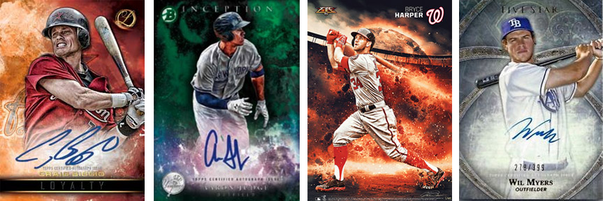
These are all beautiful designs, but they look like virtually all of them should belong in the same set.
Heck, I just picked up a 2015 National Treasures card I needed, got worried that it was the 2014 instead because I forgot they were similar. When it got here, I found out that I was wrong on both accounts. It was a card from Immaculate that I already had. They all just looked too similar in my head!
I have been a big supporter of the big card companies – I love that they come out with cool stuff, however, I guess it is wearing on me a bit. It seems like each year, we are being pushed to buy the same picture with a different card design in the background and in 10 different colors, with one of them being the all mighty 1 of 1. The sheer volume and redundancy year after year can give any super collector fits!
Patches, autographs, serial numbered cards (yes … even 1/1 serial numbered cards!) are not exactly rare anymore. Heck, the “huge” cards that were once found in mid-range packs are not as special anymore, thanks to the glut of high end products constantly being invented that have nothing but high end cards in them.
I am torn.
When I see a card I like, half of me hopes that Canseco is included, just so I can enjoy how it looks, but then the other half of me kind of sighs because it is another card with the same picture as the year before with 20 color variations to chase. I’m finding myself enjoying the manufactured 1/1’s less and less, when compared to the cards like the 92 fleer ultra prototypes I scored or the original comic book artwork I picked up.
While I’m not about to give up collecting anytime soon, I find myself being more and more disillusioned with every release and a tad more choosy in what I buy for my collection. The super collector mindset of “gotta have it all” doesn’t work too well in 2016 when you want to continue to enjoy this hobby without feeling like you are on a hamster wheel trying to keep up with all of the new releases.
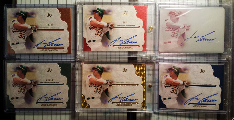
So for me, this is where the customs come in. More than ever for me, customs fill an ever-widening hole. A hole where more cards are being produced, but fewer are scratching that collecting “itch”. It frustrates me that a regular autograph can go for $10, whereas the exact same card with a different color background can go for hundreds more.
Because of this, I find myself sometimes sacrificing one of those poor little $10 base autograph cards to customize and make up a fantasy superfractor like this:
Why? Because 5 different types simply isn’t near enough for a rainbow.
Customs are great for when one of your guys hasn’t been featured on (m)any high end cards while playing for your team, and you have donor cards because you don’t care about him playing for anyone else:
Or perhaps some of your favorite player was simply never included in any of your favorite sets of cards
1997 Finest Atomic Refractor utilizing junk wax images
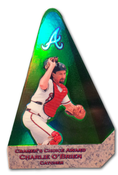
Cramer’s Choice die cut w/a few enhancements
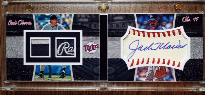
Some others that you likely won’t be seeing anytime soon in packs are dual “pawtograph” / dog-worn sweater relic books:
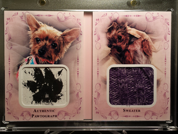
Or even a relic that one of your favorite players was known for chewing on:
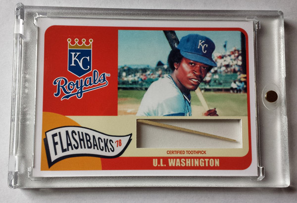
I mean, c’mon Topps! Where is the certified toothpick love? 🙂
Perhaps one of the other reasons that customs are so enjoyable for me, is because each one has a story of how it was built. In a sense, the card feels like it has soul. I tend to feel that some of the new cards just feel soul-less when compared to their earlier counterparts.
Here are a few stories of some of my newest PC custom cards.
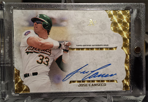
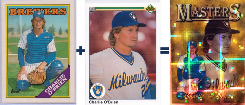
Remember the highly photoshopped Topps/Bowman cards that I mentioned above that look like they could all be in the same set? Well, I happen to like the design, quite a bit. I’ve said this line before and I’ll probably say it again, but while I was bummed Jose wasn’t included, I’m glad he wasn’t now so I could have a go at it. Here was the card that inspired me to give it a go:
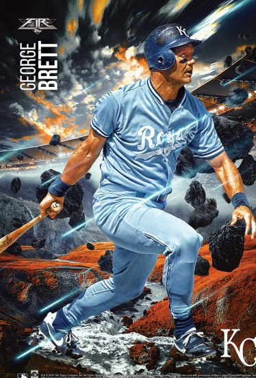
Look, I know. I get it. It doesn’t make sense – why is Brett playing baseball in what is clearly being depicted as an apocalyptic end times battle between good and evil? I don’t know, but it sings to me. It reminds me of the fun flash animation / photoshop abstract art I used to create 15 years ago.
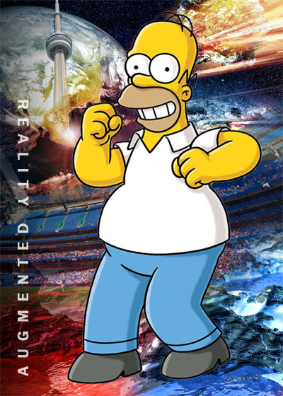
I came up with my own. A photoshopped mashup of several heavily modified pictures. In case you can’t tell, there is a baseball stadium, mountains, asteroids about to hit the earth … you name it, it is in there.
![]()
Add a cool sounding name like “Augmented Reality” (Why not? Naming the card is half the fun!) and put your favorite player on it:
Ehhh…wrong guy. Trying again.
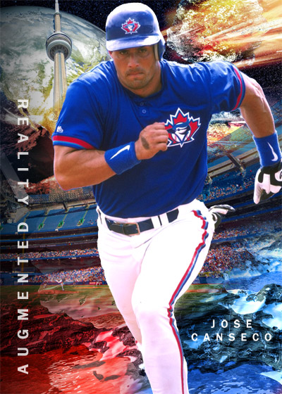
There it is! But something isn’t quite right. Oh no! Jose is breaking out of his “real” body and into his photoshopped body!
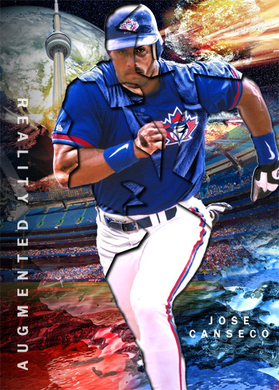
To which we arrive with this:
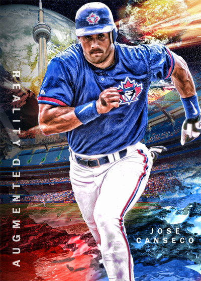
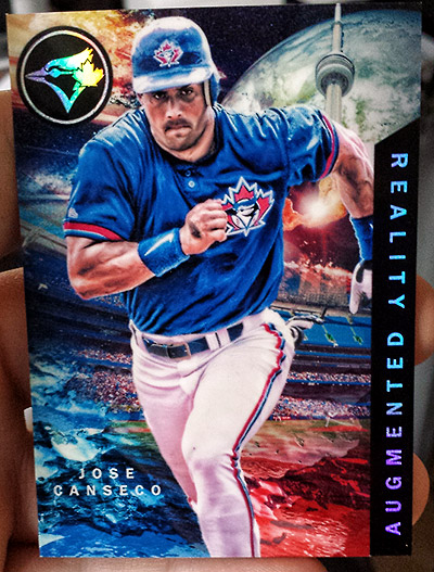
I thought I could amp it up a bit with some holofoil, so I did. Here is a pic of it as a “real” card:
Sometimes, I’ll draw inspiration from other cards from other sports that catch my eye:
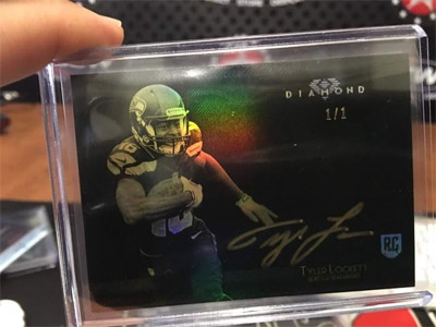
I didn’t think much of the card until I really started thinking about how it could be executed. The card above had a gold ink signature, and I remembered that I had Jose sign some silver and gold ink blanks for me last year.
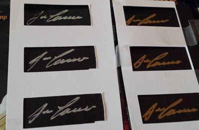
I used these primarily because of the texture and look of the material signed on. Take a closer look:
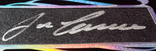
The silver signature paired up very nicely with the card I came up with “Behind the Plate”
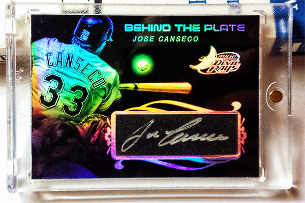
The entire player, ball, logo and lettering all seem to GLOW while shifting the rainbow colors depending upon how you hold it. It came out very cool in person!
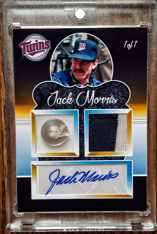
Finally, when a card that is produced by one of the big boys, it is a 1 of 1 and you missed it, I’ve gotta say that is a BIG motivation to create something truly unique. In this case, it was a National Treasures button card. I was unable to grab it, but figured I might as well make a truly unique button card for myself. Heck, I have plenty of jerseys and other things worn by Canseco for such a time as this, so why not?
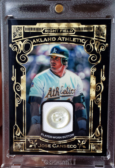
This card means a lot to me. Aside from the fact that I’m very pleased with how the design and finish came out, it fills a (button) hole in my collection – not by using a piece of a jersey that was supposedly worn in a game, but by using a piece that was definitely worn on the biggest day of my *baseball* life by my favorite baseball player. Does this card have soul to me? Yeah, you bet it does.
The longer I do this, the more I find that these customs mean to me, and the more I hear what they mean to those who I make them for. It takes away the stress of being the winner of a hard to find card, and gives me pure enjoyment to add to my collection (when everything goes according to plan, that is!) Heck, a part of their story comes from when I write about them, show them and receive positive feedback. They won’t ever have a “book value” but that is fine by me.

This looks so fun! What kind of materials would you suggest to someone who wanted to try playing around with their own ideas?
This is the #1 question I’m asked – I’m not ready to spill the beans yet, but keep checking back – I may do a “how to” article at some point! 🙂
I’m blown away by every custom example on this page.