Last night, the city of Houston was treated to a torrential downpour, and isn’t expected to be finished until Wednesday night. At around midnight, we decided to go out and watch as hail pelted our roof. The rain came down so fierce, we could hardly see the houses across the street!
When I woke up, all was quiet. After enjoying some delicious milk with breakfast,

I had to run my folks back to their house since they borrowed our car yesterday. On the way, our neighborhood looked like it had been hit by a friggin’ tornado. This is a pic of one of the many downed trees in the neighborhood just past the lake.
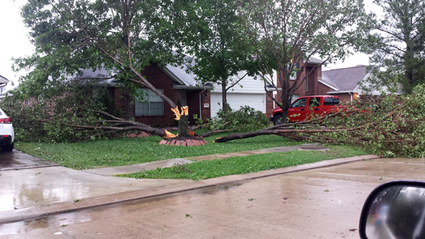
After looking at this, I got to thinking … lake? I don’t remember us having a lake in the neighborhood.

The pic does not justice to this, but this thing is massive. It is HUGE. And it wasn’t there yesterday. At all. (Confession: I *may* have photoshopped in Nessie.)
Fences were busted all over the place, trampolines flipped over and play structures were upside down. It was crazy! Thankfully, our house and my parent’s house was fine.
After dropping them off back home, I got to my computer to “get my work on” and the worst possible thing ever happened:
CANNOT REACH THE INTERNET.
For FOUR hours, I was in complete disarray. Panic attacks ensued, fits of rage, hysteria, etc.
Then I remembered … I had a few custom projects to work on! Rather, I wanted to “tweak” some existing cards in my collection.
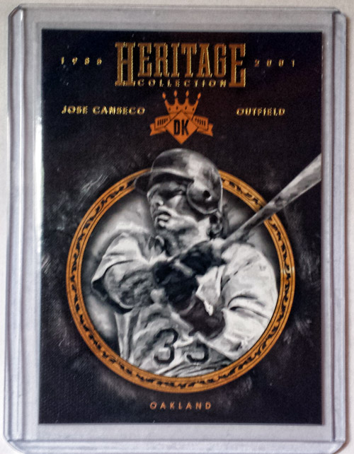
I don’t know about you, but I REALLY like the new Diamond Kings. They have done a fantastic job (at least with Jose’s cards) not being so overt about the lack of logos. These cards just don’t look “unlicensed”. From the finish/texture of the cards to the graphic manipulation, they are beautiful and in my opinion beat many licensed cards out there.
That is why I was super hyped about the Canseco 1/1 showing up on eBay! Out of all the Diamond King cards for Canseco, this is THE card to have. And it is mine BWAHAHAHAAHAHA!
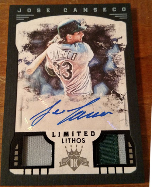
The picture selection, the graphics work, the autograph … all of it works so well. My only qualm with it is this: Why did they put a single color swatch on the left side? It is still a 1/1 so it can get away with it, but why…why….WHY????
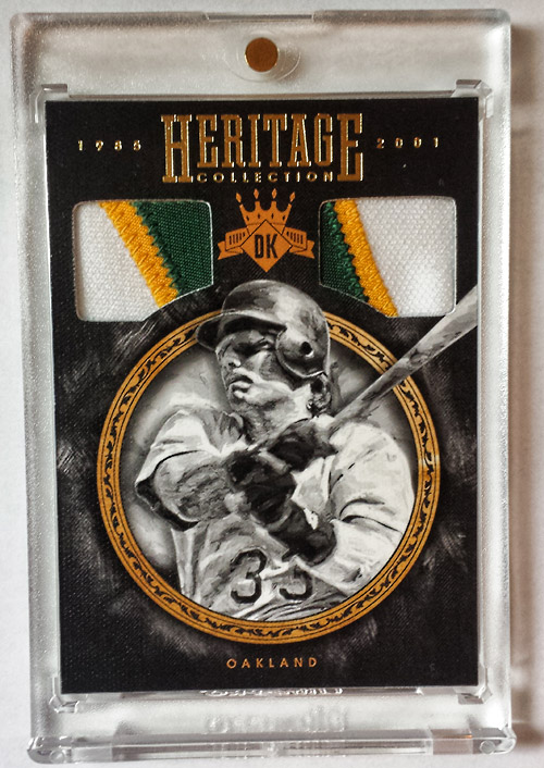
I decided to correct this by … modifying it a bit with some Canseco player worn material.
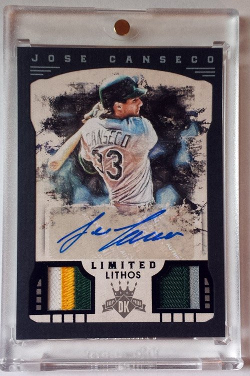
NOW it is correct, in my opinion. A player worn patch on the left from a “home” jersey and a game used patch from an “away” jersey on the right. I think it all balances out very smoothly now, and cannot tell you how much I love how it looks!
I am sure you might be wondering “why on earth would he destroy such a rare and expensive card just for some extra color?” Well, 2 things: 1) I think the card now looks like it is on another level than when it came from the factory, and 2) I didn’t have to do a single thing to modify the card other than carefully slide in some material from the top! That’s right. If I ever wanted to sell, I could just tweezer out the material from the top, and it’ll be back to normal!
Typically, I cannot do this with cards, but the “pockets” on the front were so deep, I was able to. Now it is exactly how I want it. Plus, it got me to thinking again: the back of the card says game used, and technically it IS still true. I wonder if card companies have ever added any color on top of a game used swatch to make it more appealing? Things that make you go hmmm….
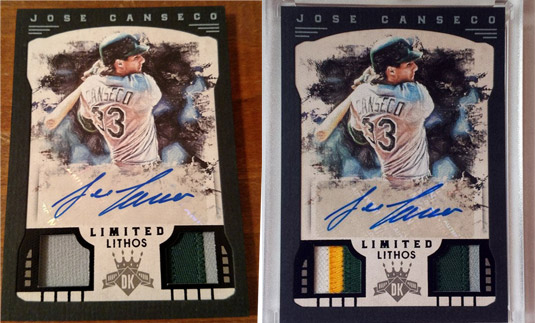
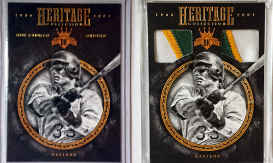
Here is the comparison side by side:
Next up is a card I’ve been thinking about trying out for a while now. I don’t typically get too terribly excited about base cards, but I thought this had potential. Especially, since I had a few doubles to play with!
dasiegel was kind enough to send me this card for FREE for my collection. (Thanks again dasiegel!). I didn’t have it yet so I am glad to have it marked off on my checklist now.
GoBeavs reached out to me saying that he had a 2016 Donruss Signature Series gold /7 for sale. I scooped that up (it is another one of my favorite type of cards for 2016) and he sent me two Heritage duplicates for free along with them.
Since my internet was STILL out, I decided to work up an idea. What if this card had a jersey swatch? Wait … what about a swatch and a bat? No…dual swatch!? Meh … if I’m doing this, let’s go all the way. Dual patch, baby!
But where do I put the pieces? The bottom seemed too crowded, so I opted to place them at the top centered between the graphic circle and the Heritage logo, on both sides of the Diamond Kings logo.
Once again, a player-worn dual patch card. It COMPLETELY transformed the look of the card, didn’t it? Here are the two cards next to each other:
From an aesthetics perspective, I am not sure which one I like better … the modified 1/1 limited lithos or the modified heritage. Though the 1/1 is worth hundreds of the heritage base cards, I love them both.
Doing this kind of “work” I guess kind of fooled me into thinking I was productive in spite of an internet outage. Either way, I’m happy that these turned out like they did. I know I typically make cards from scratch, but it has been an absolute blast messing around with cards from the factory to make new creations for my collection.

Leave A Comment
You must be logged in to post a comment.